Aidan's Advanced Portfolio
Tuesday, 21 December 2010
Evaluation
In what ways does your media product use, develop or challenge forms and conventions of real media products?
Main conventions are evident in music videos seen regularly on popular TV channels that are dominated by popular artists, more niche genres of music that market themselves using different techniques and sources other then television still use similar conventions in there music videos. Mainstream artists use conventions that are used in order to grasp audience attention and keep the viewer interested, the same style can be seen in less mainstream artists work. Fast cutting is seen regularly in music videos highlighted by Pete Fraser and by doing this it keeps the audience watching as something new is happening throughout the video. Other contrast and colour varies depending on the nature and genre of the song, for example up beat and fast paced genres that are made specifically for a market such as dance music may have slightly faster cuts then the slower and more mellow sound of indie rock music. The shots seen in the video also change for each genre as different genres; videos made for dance videos that have little lyrics are rarely made with a storyline and instead have shots of people in clubs listening to the song as this is where most of dance music is played. Songs that are made to be catchy and have lyrics throughout, usually have videos telling a story to the audience, This style of video is mainly seen in R&B videos, more heavy music such as death metal and love metal have videos of them playing live gigs or more abstract footage of things that apply to the niche market. Different angles of things are seen in almost every video, close ups and long shots make the music video interesting and indulging to the audience. Repeating shots throughout a video that has importance to the song or the message of the video is regularly played in the chorus of the song so that the image is remembered by the audience. Richard dyers theory on stars is a great example of mainstream bands and artist, the artists usually feature in the video due to popularity of the act and it gives the audience a bigger reason to watch, artists can usually be seen acting in music videos, the person usually featured is the lead singer of the band as they are most likely to be the most popular member amongst fans. This technique is usually seen more in the pop rock and R&B scene that dominates the record industry, artists that rely on the music that come from a smaller market such as dubstep and techno have shots of people enjoying there music instead of featuring in there videos as there are little amounts of lyrics to create a storyline through the there music. Theorists such as Andrew Goodwin believe that there is a relationship between the song lyrics and the music video, by giving them and example of a scenario that the lyrics may relate to helps the audience think more about the song instead of leaving it to there imagination.
Richard dyers theory could be argued to not linking with our genre of music; the dubstep genre rarely has a popular face and is well known by the music and the artists name not by the face. Fast cutting and quick edits are more apparent in the dance and dubstep scene wit shots being on the screen rarely over a few seconds, this created difficulty in making our dubstep video as taking a good range of shots and angles that are not repeated in the video so not to loose audience interest is difficult, we simply overcame this by creating a video that had a storyline but also had abstract themes and shots to it. Long pieces of footage that were used in our video were split up with shots of other relevant things that made the video fast paced and interesting. By having fast cuts the video is made to be playing to the beat of the song, changes in the tone or pace can be highlighted in what is being seen on the screen. By having a lot going on on the screen it gives the audience a great viewing experience as there is a great number of inventive and original shots. Dance and dubstep music videos tend to be film inside of a club or at a party, this gives the audience a feel of how the song should be experienced, bright neon lights, smoke and lasers are regularly seen in this genre of music videos creating an abstract but also up beat party theme to the song and video. The DJ is regularly seen performing in the videos not as an actor but performing a gig, this technique inspired Robert and I as we enjoyed the idea of a performance element in our video. We decided to use shots of our artist Dubfiend performing, problems occurred when gaining access to film a live gig without a clubs permission can be difficult, in order to overcome this Robert and I set up a room with plain walls and a good atmosphere that could be pulled off as a night club, Dubfiends equipment has neon lights and all different types of settings that allowed us to portray a rave and a live gig that artists such as Dubfiend would perform.
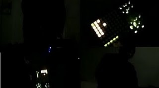
By choosing a song that had lyrics that allowed us to work with and create a story out of really helped create a music video that allowed the audience to relate and take interest in. By adapting what we believed the lyrics meant into a visual aid, it gave the audience a deeper look into the song and the artist’s reason for creating it. The themes that are shown in the video, although exaggerated at times are very relevant to our target audience of late teens. By using the camera in various different ways to give our video an original style, it allowed us to create an up beat and powerful messaged video. Someone shots are repeated a few times throughout our video this is simply to ensure that the audience understands the storyline and the key message behind our video. The use of foreshadowing is evident in our video and layers are used leaving the true meaning of what is going on secret until the end where fast cuts are used to remind the audience who what when where and why this has happened and why people are after the main character. Although the song is more about the beat and the way people can move to it, the little lyrics that are in it “No one's gonna take me alive, the time has come to make things right, you and I must fight for our rights, you and I must fight to survive” create a vision in the listeners head. Robert and I ensured that these lyrics were relevant to what was being seen in the video, by having a character seen mostly alone throughout the video it has a sense of every man for himself attitude linking to the lyrics. We tried to touch on subjects that have relevance to every aspect of the lyrics. I considered that “fight to survive” was the main focus in the lyrics and Robert and I staged a scene of a confrontation between a group of teenagers that ends up with a small fight which links to the lyrics. To ensure that we grasped the audience full attention we felt it was vital for one shot to be on the screen no longer then a few seconds, scenes that could not be explained with a few seconds were made more interesting by using various shot types and angles to portray point of views, this made the music video more intresting and gave the audience a wider picture of what is happening in the video. By using a skilled actor as our character it gave us the ability to be more experimental with shots that needed more acting skills rather then adventurous shots such as extreme close ups. With the genre of choice Robert and I chose it gave us the use chance to experiment with different shots that tie into what the video is about and also be relevant to the pace and tone of the song.
How effective is the combination of your main product and ancillary texts?
When the project to create a music video was set, we were also set to create a website for our artist and a digi-pack. Before starting to create these Robert and I both agreed that we would like the input of Dubfiend on this project as we were making it for him, by pitching our original ideas he was impressed with our ideas and with a few changes to our original ideas coming from Dubfiend we were ready to begin. We believed that colour scheme was important to keep identical between both the website and digi-pack we decided neon green and black were the most relevant choices as neon green is the colour that Dubfiend used for his sets for both stage lighting and equipment lighting, th black came purely from the idea of night time and underground themes that are relevant to the genre of Dubstep and when we put them together they went extremely well and had a club theme to them. We created a logo of a cartoon DJ at his decks that can be seen on both the website and digi-pack, the idea is that he can be easily remembered by audiences and can easily be edited to look and do what we want. By creating a logo that wasn’t the same as the original one of Dubfiends but one that he liked and approved gave us our mark in Dubfiends carrier. When creating the website on adobe Dreamweaver we were able to create the illusion of the DJ’s decks to be spinning by creating different layers played in a row, this little touch gave the website a professional feel as soon as the audience entered the website as it is one of the first things to be seen on the website.
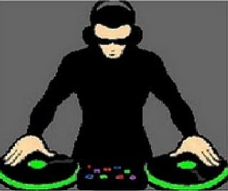
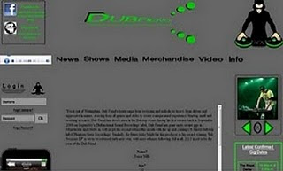
The theme of black and green is then continued throughout the website, buttons linking the site up to different pages are originally black until the mouse is scrolled over them and then they then turn neon green, this process makes the buttons look like flashing lights much like that of a night club linking to the genre of Dubfiends music. I created a photo slide that goes through images of Dubfiend and shows he has played the image is on a timer created on Dreamweaver that changes around every 2 seconds, there are numerous images in the slider that I edited on Photoshop, the photograph seen here was made to look animated like the logo and the neon green and black was made more distinguished again on Photoshop to ensure the colour scheme is continuous throughout the website and the application created on the website. The buttons seen on the photo slider are again neon green and black this is in order to ensure that they will stand out on the website and are easily seen by the audience when viewing Dubfiends website.
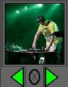
The IPod touch seen here was created on Dreamweaver, the devise scrolls through the artist pages until it reaches Dubfiend, The devise then clicks on Dubfiend and then on the song, the song then begins to play. The devise is made to look realistic and it is also and original idea and inventive way to begin playing the song on the website. The IPod was made to look professional and realistic and took time to ensure that all buttons layouts were perfectly positioned to that of a normal iPod. You can see that the iPod has many other mainstream artists among Dubfiend this is made to be symbolic that soon Dubfiend will be on everybody’s iPod and is moving rapidly though his carrier.
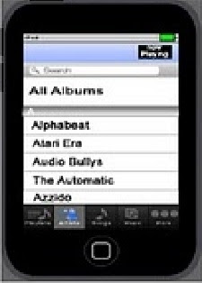
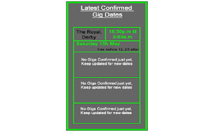
The colour scheme is continued into the latest and upcoming gigs column where the box is highlighted with the neon green seen through the website and Digi-pack. The up coming gigs box is controlled on Dreamweaver and dates and venues can be updated via the main save of the website. This is and important feature to the website and the audience should know by this point that important information is highlighted or coloured with either neon green or black. We wanted this box to be highlighted correctly so that it stands out to the audience and attracts them to attend one of Dubfiends live gigs after hearing the track on the website. The dates seen in the boxes are actual gigs and it will give Dubfiend a chance to get himself known by a wider audience other then underground and niche followers that follow the genre of dubstep.
The website overall is both simple and easy to use, although the website is simple it also looks professional and creative. Everything was made from scratch but has had enough time to put into it to ensure that it is appealing to the audience and makes it stand out. The colours are used so that the audience can create a link between Dubfiend and neon green. The layout is spaced out to make sure that there isn’t to much stuff in one place and that it is easy to navigate from page to page with ease. The font used is so that the audience can read the text clearly, it is also written out without the use of slang terms and also complicated vocabulary in order for everyone to be able to understand.
Over all I believe Robert and I have created a simple easy to use website that is well made for the artist Dubfiend. By creating a logo that is repeated throughout the Digi-pack and also the website the audience will be able to create a link through the picture and will be able to link it to Dubfiend when they see it.

The colour scheme used throughout the digi-pack and website used in texts and also pictures creates a theme of nightclubs and bright lights linking to the genre of Dubfiend. To ensure a more professional and branded digi-pack is what the audience will see Dubfiends original logo is used on the front cover as well as the one I created, this ensures that finds that already know Dubfiend with recognise the CD cover. The name Dubfiend on the front stands out through its original font and style.
What have you learned from your audience feedback?
In order to receive feedback we had a group screening where each video would be played on the projector screen, students would then make notes, noting positive and negative feedback. I feel this was an officiate way for us to get feedback from a range of people other then family and friends that are not on the course, It also gave as good idea of what other students had done with the task and how our ideas differed from there’s. I felt as though our video was different to most of the class due to the genre of the track we had chose, whilst many of the student had chose indie rock as there choice and done a video about a love song. We had originally only had feedback from people outside of college so we were not getting feedback from people who had watched it with the knowledge gained from our lessons on music videos previously in the year. To get comments and pointers from people in the position was a big help and eye opener for Robert and I.
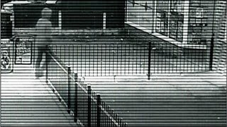
The feedback tended to have a quite a pattern with most people in and out of college commenting that we had a some great shots which worked well, they also said they were original and that we experimented well with the camera and tried out a good range of shots. A shot that was commented on in a positive sense was the security camera shot; the shot shows our character walking into a shop and out, although this looks simple and effective getting and editing the shot was difficult. In order to make the shot to look realistic, we had to get up high enough to portray a real CCTV camera, to do this we got on top of a bus shelter that was near to our shot and then zoomed and adjusted it as much as we needed to ensure the shot looked how we first thought it out. We then used editing software to portray a security camera turning it black and white with I little bit of fuzz running through it, to finish we added in the time and date and edited the time and date to a minute in the future as we had cut in time. Our viewers enjoyed the visual effects and also the angle of the shot and how we had taken it, they commented that the placement of the camera was worth the planning and had paid off. We believed by using this advance shot to show our talent through editing we would be able to grasp the viewers attention and attract them to what we have done, by screening the video and getting positive feedback on the shot we believe we achieved what we had set out to do.
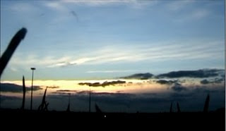
Another shot that was specifically commented on was the final shot of the video, the shot is of a sunset and the music fades out to the sunset, students commented that this was a good way to end the video. We were happy with the comment as we had spent along time setting up for the shot and waiting for a clear sky to film it, there was also a lot of time spent on the shot that could have been spent ending it differently but I really liked the idea of the song fading out to the sun going down. Location research previously done meant that we found the perfect place to shoot from with an effective mise en scene and great shot of the sky, the shot also makes it seem like clouds are falling into the town below which was unexpected but good. We were really happy with the shot and the feedback that we got from our audience and peers.
Some feedback pointed problems with our video out. A shot taken from the passenger seat of a car shows a ‘small crack’ in the windscreen that appeared quite large in the camera lens. We were advised to re film this shot but due to the snowy weather conditions we couldn’t make the deadline if we waited until the snow had melted. We both agreed we had overcome this problem by editing shots of other things that linked to the fast pacing of the song and the sped up car journey such as the party and strobe lighting.
Shots that were too long and were ‘abit boring’ were commented on by other members of the course. The shots were said to be to long with not much happening, after taking the on board Robert and I decided that they were right. The shot was of Dubfiend on his decks; the shot was split in to four and shows Dubfiend playing the track from all different angles, to overcome the students comment we decided to add the clip into a more relevant and significant place, there is quite a memorable change in the tracks sounds and tempo, we then re filmed Dubfiend, changing settings on his sounds board and flicking various switches to convey him changing the drop in the song. We also changed the brightness and the contrasts of the footage too ensure the picture is of the best quality we could create. We attempted to add in flashing lights and various other things such as smoke but the software would not let us do this with the image looking cheap and unprofessional. We then attempted to make the scene look more like a rave and a live show by adding in affects that are not as drastic and look real. We feel we overcame this difficulty the best we could with the time we had and feel that moving the shot to a more relevant time and making the image clearer and more realistic created a more defined clip to the final video.
When we got feedback from the artist we were quite nervous as to what he would think of what we had done with his track and the video we had created out of what he had produced. He was impressed with the shots that we had come up with highlighting the CCTV shot as a strong point in the video, he was also happy with the message we had created through his song and liked the adaptation of what we had created through his music. He had scene the videos first draft and enjoyed watching the final piece with added effects and more of a storyline, he commented on the use of strobe lights in a shot as a positive and a good way to link the video with genre of music he creates and the background to the genres use. He believe that the flashback shots we had added in were very affective but was quite disappointed there weren’t more, this in mind Robert and I chopped longer shots and added in more flashback shots that were not originally used. We also then added in more effects to the scene with Dubfiend in as he believed we should try and portray this clip more as a live gig then an underground practice. We enjoyed getting feedback from Dubfiend and knowing we had impressed him highlighted we had reached the target audience and following he is going for.
Overall I believe that the feedback we were given successfully helped sharpen and define the message in which we were initially portraying. I believe by re filming the shots we could that were commented on and over coming shots that we could re film help create a final product for us to put forward. The feedback highlighted areas that need working on and by writing them down we were able to reflect together and therefore overcome negative feedback. I believe what we have added and re done will affect our overall grade in a positive way.
Digi-Pack
The feedback given for our final digi-pack product helped to correct small errors that needed re doing etc. we gained feedback from different types of people that have different views on music and enjoying listening and buying different genres of music. The feedback give was mostly positive and getting feedback from a wide range of people helped.
Roberts’s family believed that the colour scheme was very effective and they enjoyed the way in which it links to the artist’s appearance in the video and also the website we had created. The use of neon green was commented on to be a good use as they link the colour with the idea of night clubs and dance music, they believed it was a good choice of colour and wouldn’t be relevant to any different genre of music. They also commented on by using the original Dubfiend logo it made the CD look genuine and professional. They believed by using a simple idea to show the artists information was a great was to attract the audience, although the outside of the CD was simple it gave the buyer chance to read all the songs and to view images of the artist in action that they were buying. They commented that by giving information of how they could follow Dubfiend on the internet or how to purchase tracks and CD’s was a good way to get the artist better known in the music society. They enjoyed reading the artist biography that was inside and stated that it was a good way to find out more about Dubfiend if they didn’t know who he was or the type of music in which he produces. They also had some ideas for us to change, although they enjoyed the simplicity of the inside and out they believed certain pages could of possible had more work done to them. The back of the CD cover is a track list; they believed that there should be more to it or more colour in order to make it stand out, taking this in mind we tried to alter the cover to look more colourful but with little time we couldn’t ensure it was to our audience’s wishes. They also commented that the page with all the pictures of Dubfiend on were a bit to hectic and had too much going on compared to the rest of the pages. To try and overcome this we deleted a few of the images to try and ensure the audience focus on just a select few images instead of a collage of images. Robert and I felt this feedback was fare and a good way to make our digi-pack as good as it could possibly be by asking different types of audiences.
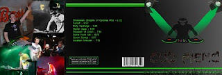
When asking Dubfiend his thoughts on our digi-pack he thought that colour and contrast though the inside and outside of the pack worked well and was consistence, he believed that by using a consistent colour scheme would create a link to his genre of music
Website
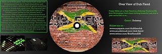
Dubfiend was the only person to look over our website design, he commented that the colours were well used and by having the theme throughout all the products in which he had created gave a professional feel and an impressive idea for him to take forward in the future. He liked the way it was easy to navigate around and the simplicity in reading the text that was used. By having everything on show on the homepage it allows everyone to navigate around the website with ease and not get stuck when looking for something. The tool bar across the top allows the user to click on everything that the website has to offer and go to that page. He mentioned that the lay out is neat and looks professionally done. We believed that this feedback was helpful and it highlighted the positive points that we had created within the website and with the comment on the colour also the video and digi-pack. He said that the box in the centre of the website was too big for the little amount of information that was contained inside of it, too overcome this feedback we then edited the gap above and below the box to make it better use of space, it also gives chance to update around it, if there’s new things to put on the website. Robert and I are extremely happy with our final website and know we have the best product we could with the software we used.

How did you use new media technologies in the construction and research, planning and evaluation stages?
At the beginning of September we were given the criteria for our course we were told that the course consisted of several different things revolving around the construction of a music video. Our teacher explained about copyright infringement and the rules with creating them music video. To begin the course we were shown videos of previous student’s work that had created the same style of project over the past few years, in order to create the project we first had to find a track that was not under copyrights laws or a track that we could easily ask permission to use. Difficulty came from not being certain on the genre of music we would like to base a music video on. We used a website sound cloud to search for various artists that we enjoyed listening to and we could get hold of to ask for permission.

After failing to decide on a song that we both agreed on we began drafting a letter that would be relevant to various artists that we would be able to send to and hopefully get permission to use there track. It is easy enough to send letters and emails to bands on sites such as MySpace but it not 100% certain you will get the reply you are hoping for if any. After thinking about this logically and discussing the bands that we would want in depth it would be next to impossible to get the bands to agree to allow us to use there tracks without a cost. Robert and I then brainstormed a list of tracks that our brothers had produced but they were both of two completely different genres, my brother’s music is of the indie folk rock persuasion and Roberts is the dubstep genre. We then each chose a couple of tracks each and we narrowed it down to one, Dubfiend- showdown, we believed with this track we could successfully interpret the lyrics to our own to create a well produced and well directing music video. After listening to the song and creating a mind map of ideas and storyboard we made a final storyboard.
When doing the video analysis and shot by shot analysis I used www.youtube.com in order to find a suitable video to analyse. I also used YouTube when uploading videos, instead of uploading straight to my blog we decided to upload to YouTube in order for a wider audience to see the video and enjoy what we had created and produced.

When planning and researching suitable locations to film I used a digital camera to take photos of the locations we would like to film, by doing this we had a visual reminder of what and where we filming.
When doing our final CD cover I used adobe Photoshop to edit the CD cover experience in other subjects such as photography helped me do this quickly and easily with little difficulty, this created a simple but professional looking CD cover.
Main conventions are evident in music videos seen regularly on popular TV channels that are dominated by popular artists, more niche genres of music that market themselves using different techniques and sources other then television still use similar conventions in there music videos. Mainstream artists use conventions that are used in order to grasp audience attention and keep the viewer interested, the same style can be seen in less mainstream artists work. Fast cutting is seen regularly in music videos highlighted by Pete Fraser and by doing this it keeps the audience watching as something new is happening throughout the video. Other contrast and colour varies depending on the nature and genre of the song, for example up beat and fast paced genres that are made specifically for a market such as dance music may have slightly faster cuts then the slower and more mellow sound of indie rock music. The shots seen in the video also change for each genre as different genres; videos made for dance videos that have little lyrics are rarely made with a storyline and instead have shots of people in clubs listening to the song as this is where most of dance music is played. Songs that are made to be catchy and have lyrics throughout, usually have videos telling a story to the audience, This style of video is mainly seen in R&B videos, more heavy music such as death metal and love metal have videos of them playing live gigs or more abstract footage of things that apply to the niche market. Different angles of things are seen in almost every video, close ups and long shots make the music video interesting and indulging to the audience. Repeating shots throughout a video that has importance to the song or the message of the video is regularly played in the chorus of the song so that the image is remembered by the audience. Richard dyers theory on stars is a great example of mainstream bands and artist, the artists usually feature in the video due to popularity of the act and it gives the audience a bigger reason to watch, artists can usually be seen acting in music videos, the person usually featured is the lead singer of the band as they are most likely to be the most popular member amongst fans. This technique is usually seen more in the pop rock and R&B scene that dominates the record industry, artists that rely on the music that come from a smaller market such as dubstep and techno have shots of people enjoying there music instead of featuring in there videos as there are little amounts of lyrics to create a storyline through the there music. Theorists such as Andrew Goodwin believe that there is a relationship between the song lyrics and the music video, by giving them and example of a scenario that the lyrics may relate to helps the audience think more about the song instead of leaving it to there imagination.
Richard dyers theory could be argued to not linking with our genre of music; the dubstep genre rarely has a popular face and is well known by the music and the artists name not by the face. Fast cutting and quick edits are more apparent in the dance and dubstep scene wit shots being on the screen rarely over a few seconds, this created difficulty in making our dubstep video as taking a good range of shots and angles that are not repeated in the video so not to loose audience interest is difficult, we simply overcame this by creating a video that had a storyline but also had abstract themes and shots to it. Long pieces of footage that were used in our video were split up with shots of other relevant things that made the video fast paced and interesting. By having fast cuts the video is made to be playing to the beat of the song, changes in the tone or pace can be highlighted in what is being seen on the screen. By having a lot going on on the screen it gives the audience a great viewing experience as there is a great number of inventive and original shots. Dance and dubstep music videos tend to be film inside of a club or at a party, this gives the audience a feel of how the song should be experienced, bright neon lights, smoke and lasers are regularly seen in this genre of music videos creating an abstract but also up beat party theme to the song and video. The DJ is regularly seen performing in the videos not as an actor but performing a gig, this technique inspired Robert and I as we enjoyed the idea of a performance element in our video. We decided to use shots of our artist Dubfiend performing, problems occurred when gaining access to film a live gig without a clubs permission can be difficult, in order to overcome this Robert and I set up a room with plain walls and a good atmosphere that could be pulled off as a night club, Dubfiends equipment has neon lights and all different types of settings that allowed us to portray a rave and a live gig that artists such as Dubfiend would perform.

By choosing a song that had lyrics that allowed us to work with and create a story out of really helped create a music video that allowed the audience to relate and take interest in. By adapting what we believed the lyrics meant into a visual aid, it gave the audience a deeper look into the song and the artist’s reason for creating it. The themes that are shown in the video, although exaggerated at times are very relevant to our target audience of late teens. By using the camera in various different ways to give our video an original style, it allowed us to create an up beat and powerful messaged video. Someone shots are repeated a few times throughout our video this is simply to ensure that the audience understands the storyline and the key message behind our video. The use of foreshadowing is evident in our video and layers are used leaving the true meaning of what is going on secret until the end where fast cuts are used to remind the audience who what when where and why this has happened and why people are after the main character. Although the song is more about the beat and the way people can move to it, the little lyrics that are in it “No one's gonna take me alive, the time has come to make things right, you and I must fight for our rights, you and I must fight to survive” create a vision in the listeners head. Robert and I ensured that these lyrics were relevant to what was being seen in the video, by having a character seen mostly alone throughout the video it has a sense of every man for himself attitude linking to the lyrics. We tried to touch on subjects that have relevance to every aspect of the lyrics. I considered that “fight to survive” was the main focus in the lyrics and Robert and I staged a scene of a confrontation between a group of teenagers that ends up with a small fight which links to the lyrics. To ensure that we grasped the audience full attention we felt it was vital for one shot to be on the screen no longer then a few seconds, scenes that could not be explained with a few seconds were made more interesting by using various shot types and angles to portray point of views, this made the music video more intresting and gave the audience a wider picture of what is happening in the video. By using a skilled actor as our character it gave us the ability to be more experimental with shots that needed more acting skills rather then adventurous shots such as extreme close ups. With the genre of choice Robert and I chose it gave us the use chance to experiment with different shots that tie into what the video is about and also be relevant to the pace and tone of the song.
How effective is the combination of your main product and ancillary texts?
When the project to create a music video was set, we were also set to create a website for our artist and a digi-pack. Before starting to create these Robert and I both agreed that we would like the input of Dubfiend on this project as we were making it for him, by pitching our original ideas he was impressed with our ideas and with a few changes to our original ideas coming from Dubfiend we were ready to begin. We believed that colour scheme was important to keep identical between both the website and digi-pack we decided neon green and black were the most relevant choices as neon green is the colour that Dubfiend used for his sets for both stage lighting and equipment lighting, th black came purely from the idea of night time and underground themes that are relevant to the genre of Dubstep and when we put them together they went extremely well and had a club theme to them. We created a logo of a cartoon DJ at his decks that can be seen on both the website and digi-pack, the idea is that he can be easily remembered by audiences and can easily be edited to look and do what we want. By creating a logo that wasn’t the same as the original one of Dubfiends but one that he liked and approved gave us our mark in Dubfiends carrier. When creating the website on adobe Dreamweaver we were able to create the illusion of the DJ’s decks to be spinning by creating different layers played in a row, this little touch gave the website a professional feel as soon as the audience entered the website as it is one of the first things to be seen on the website.

The theme of black and green is then continued throughout the website, buttons linking the site up to different pages are originally black until the mouse is scrolled over them and then they then turn neon green, this process makes the buttons look like flashing lights much like that of a night club linking to the genre of Dubfiends music. I created a photo slide that goes through images of Dubfiend and shows he has played the image is on a timer created on Dreamweaver that changes around every 2 seconds, there are numerous images in the slider that I edited on Photoshop, the photograph seen here was made to look animated like the logo and the neon green and black was made more distinguished again on Photoshop to ensure the colour scheme is continuous throughout the website and the application created on the website. The buttons seen on the photo slider are again neon green and black this is in order to ensure that they will stand out on the website and are easily seen by the audience when viewing Dubfiends website.

The IPod touch seen here was created on Dreamweaver, the devise scrolls through the artist pages until it reaches Dubfiend, The devise then clicks on Dubfiend and then on the song, the song then begins to play. The devise is made to look realistic and it is also and original idea and inventive way to begin playing the song on the website. The IPod was made to look professional and realistic and took time to ensure that all buttons layouts were perfectly positioned to that of a normal iPod. You can see that the iPod has many other mainstream artists among Dubfiend this is made to be symbolic that soon Dubfiend will be on everybody’s iPod and is moving rapidly though his carrier.

The colour scheme is continued into the latest and upcoming gigs column where the box is highlighted with the neon green seen through the website and Digi-pack. The up coming gigs box is controlled on Dreamweaver and dates and venues can be updated via the main save of the website. This is and important feature to the website and the audience should know by this point that important information is highlighted or coloured with either neon green or black. We wanted this box to be highlighted correctly so that it stands out to the audience and attracts them to attend one of Dubfiends live gigs after hearing the track on the website. The dates seen in the boxes are actual gigs and it will give Dubfiend a chance to get himself known by a wider audience other then underground and niche followers that follow the genre of dubstep.

The website overall is both simple and easy to use, although the website is simple it also looks professional and creative. Everything was made from scratch but has had enough time to put into it to ensure that it is appealing to the audience and makes it stand out. The colours are used so that the audience can create a link between Dubfiend and neon green. The layout is spaced out to make sure that there isn’t to much stuff in one place and that it is easy to navigate from page to page with ease. The font used is so that the audience can read the text clearly, it is also written out without the use of slang terms and also complicated vocabulary in order for everyone to be able to understand.

Over all I believe Robert and I have created a simple easy to use website that is well made for the artist Dubfiend. By creating a logo that is repeated throughout the Digi-pack and also the website the audience will be able to create a link through the picture and will be able to link it to Dubfiend when they see it.

The colour scheme used throughout the digi-pack and website used in texts and also pictures creates a theme of nightclubs and bright lights linking to the genre of Dubfiend. To ensure a more professional and branded digi-pack is what the audience will see Dubfiends original logo is used on the front cover as well as the one I created, this ensures that finds that already know Dubfiend with recognise the CD cover. The name Dubfiend on the front stands out through its original font and style.
What have you learned from your audience feedback?
In order to receive feedback we had a group screening where each video would be played on the projector screen, students would then make notes, noting positive and negative feedback. I feel this was an officiate way for us to get feedback from a range of people other then family and friends that are not on the course, It also gave as good idea of what other students had done with the task and how our ideas differed from there’s. I felt as though our video was different to most of the class due to the genre of the track we had chose, whilst many of the student had chose indie rock as there choice and done a video about a love song. We had originally only had feedback from people outside of college so we were not getting feedback from people who had watched it with the knowledge gained from our lessons on music videos previously in the year. To get comments and pointers from people in the position was a big help and eye opener for Robert and I.
The feedback tended to have a quite a pattern with most people in and out of college commenting that we had a some great shots which worked well, they also said they were original and that we experimented well with the camera and tried out a good range of shots. A shot that was commented on in a positive sense was the security camera shot; the shot shows our character walking into a shop and out, although this looks simple and effective getting and editing the shot was difficult. In order to make the shot to look realistic, we had to get up high enough to portray a real CCTV camera, to do this we got on top of a bus shelter that was near to our shot and then zoomed and adjusted it as much as we needed to ensure the shot looked how we first thought it out. We then used editing software to portray a security camera turning it black and white with I little bit of fuzz running through it, to finish we added in the time and date and edited the time and date to a minute in the future as we had cut in time. Our viewers enjoyed the visual effects and also the angle of the shot and how we had taken it, they commented that the placement of the camera was worth the planning and had paid off. We believed by using this advance shot to show our talent through editing we would be able to grasp the viewers attention and attract them to what we have done, by screening the video and getting positive feedback on the shot we believe we achieved what we had set out to do.

Another shot that was specifically commented on was the final shot of the video, the shot is of a sunset and the music fades out to the sunset, students commented that this was a good way to end the video. We were happy with the comment as we had spent along time setting up for the shot and waiting for a clear sky to film it, there was also a lot of time spent on the shot that could have been spent ending it differently but I really liked the idea of the song fading out to the sun going down. Location research previously done meant that we found the perfect place to shoot from with an effective mise en scene and great shot of the sky, the shot also makes it seem like clouds are falling into the town below which was unexpected but good. We were really happy with the shot and the feedback that we got from our audience and peers.

Some feedback pointed problems with our video out. A shot taken from the passenger seat of a car shows a ‘small crack’ in the windscreen that appeared quite large in the camera lens. We were advised to re film this shot but due to the snowy weather conditions we couldn’t make the deadline if we waited until the snow had melted. We both agreed we had overcome this problem by editing shots of other things that linked to the fast pacing of the song and the sped up car journey such as the party and strobe lighting.

Shots that were too long and were ‘abit boring’ were commented on by other members of the course. The shots were said to be to long with not much happening, after taking the on board Robert and I decided that they were right. The shot was of Dubfiend on his decks; the shot was split in to four and shows Dubfiend playing the track from all different angles, to overcome the students comment we decided to add the clip into a more relevant and significant place, there is quite a memorable change in the tracks sounds and tempo, we then re filmed Dubfiend, changing settings on his sounds board and flicking various switches to convey him changing the drop in the song. We also changed the brightness and the contrasts of the footage too ensure the picture is of the best quality we could create. We attempted to add in flashing lights and various other things such as smoke but the software would not let us do this with the image looking cheap and unprofessional. We then attempted to make the scene look more like a rave and a live show by adding in affects that are not as drastic and look real. We feel we overcame this difficulty the best we could with the time we had and feel that moving the shot to a more relevant time and making the image clearer and more realistic created a more defined clip to the final video.
When we got feedback from the artist we were quite nervous as to what he would think of what we had done with his track and the video we had created out of what he had produced. He was impressed with the shots that we had come up with highlighting the CCTV shot as a strong point in the video, he was also happy with the message we had created through his song and liked the adaptation of what we had created through his music. He had scene the videos first draft and enjoyed watching the final piece with added effects and more of a storyline, he commented on the use of strobe lights in a shot as a positive and a good way to link the video with genre of music he creates and the background to the genres use. He believe that the flashback shots we had added in were very affective but was quite disappointed there weren’t more, this in mind Robert and I chopped longer shots and added in more flashback shots that were not originally used. We also then added in more effects to the scene with Dubfiend in as he believed we should try and portray this clip more as a live gig then an underground practice. We enjoyed getting feedback from Dubfiend and knowing we had impressed him highlighted we had reached the target audience and following he is going for.
Overall I believe that the feedback we were given successfully helped sharpen and define the message in which we were initially portraying. I believe by re filming the shots we could that were commented on and over coming shots that we could re film help create a final product for us to put forward. The feedback highlighted areas that need working on and by writing them down we were able to reflect together and therefore overcome negative feedback. I believe what we have added and re done will affect our overall grade in a positive way.
Digi-Pack
The feedback given for our final digi-pack product helped to correct small errors that needed re doing etc. we gained feedback from different types of people that have different views on music and enjoying listening and buying different genres of music. The feedback give was mostly positive and getting feedback from a wide range of people helped.
Roberts’s family believed that the colour scheme was very effective and they enjoyed the way in which it links to the artist’s appearance in the video and also the website we had created. The use of neon green was commented on to be a good use as they link the colour with the idea of night clubs and dance music, they believed it was a good choice of colour and wouldn’t be relevant to any different genre of music. They also commented on by using the original Dubfiend logo it made the CD look genuine and professional. They believed by using a simple idea to show the artists information was a great was to attract the audience, although the outside of the CD was simple it gave the buyer chance to read all the songs and to view images of the artist in action that they were buying. They commented that by giving information of how they could follow Dubfiend on the internet or how to purchase tracks and CD’s was a good way to get the artist better known in the music society. They enjoyed reading the artist biography that was inside and stated that it was a good way to find out more about Dubfiend if they didn’t know who he was or the type of music in which he produces. They also had some ideas for us to change, although they enjoyed the simplicity of the inside and out they believed certain pages could of possible had more work done to them. The back of the CD cover is a track list; they believed that there should be more to it or more colour in order to make it stand out, taking this in mind we tried to alter the cover to look more colourful but with little time we couldn’t ensure it was to our audience’s wishes. They also commented that the page with all the pictures of Dubfiend on were a bit to hectic and had too much going on compared to the rest of the pages. To try and overcome this we deleted a few of the images to try and ensure the audience focus on just a select few images instead of a collage of images. Robert and I felt this feedback was fare and a good way to make our digi-pack as good as it could possibly be by asking different types of audiences.

When asking Dubfiend his thoughts on our digi-pack he thought that colour and contrast though the inside and outside of the pack worked well and was consistence, he believed that by using a consistent colour scheme would create a link to his genre of music

Website
Dubfiend was the only person to look over our website design, he commented that the colours were well used and by having the theme throughout all the products in which he had created gave a professional feel and an impressive idea for him to take forward in the future. He liked the way it was easy to navigate around and the simplicity in reading the text that was used. By having everything on show on the homepage it allows everyone to navigate around the website with ease and not get stuck when looking for something. The tool bar across the top allows the user to click on everything that the website has to offer and go to that page. He mentioned that the lay out is neat and looks professionally done. We believed that this feedback was helpful and it highlighted the positive points that we had created within the website and with the comment on the colour also the video and digi-pack. He said that the box in the centre of the website was too big for the little amount of information that was contained inside of it, too overcome this feedback we then edited the gap above and below the box to make it better use of space, it also gives chance to update around it, if there’s new things to put on the website. Robert and I are extremely happy with our final website and know we have the best product we could with the software we used.

How did you use new media technologies in the construction and research, planning and evaluation stages?
At the beginning of September we were given the criteria for our course we were told that the course consisted of several different things revolving around the construction of a music video. Our teacher explained about copyright infringement and the rules with creating them music video. To begin the course we were shown videos of previous student’s work that had created the same style of project over the past few years, in order to create the project we first had to find a track that was not under copyrights laws or a track that we could easily ask permission to use. Difficulty came from not being certain on the genre of music we would like to base a music video on. We used a website sound cloud to search for various artists that we enjoyed listening to and we could get hold of to ask for permission.

After failing to decide on a song that we both agreed on we began drafting a letter that would be relevant to various artists that we would be able to send to and hopefully get permission to use there track. It is easy enough to send letters and emails to bands on sites such as MySpace but it not 100% certain you will get the reply you are hoping for if any. After thinking about this logically and discussing the bands that we would want in depth it would be next to impossible to get the bands to agree to allow us to use there tracks without a cost. Robert and I then brainstormed a list of tracks that our brothers had produced but they were both of two completely different genres, my brother’s music is of the indie folk rock persuasion and Roberts is the dubstep genre. We then each chose a couple of tracks each and we narrowed it down to one, Dubfiend- showdown, we believed with this track we could successfully interpret the lyrics to our own to create a well produced and well directing music video. After listening to the song and creating a mind map of ideas and storyboard we made a final storyboard.
When doing the video analysis and shot by shot analysis I used www.youtube.com in order to find a suitable video to analyse. I also used YouTube when uploading videos, instead of uploading straight to my blog we decided to upload to YouTube in order for a wider audience to see the video and enjoy what we had created and produced.

When planning and researching suitable locations to film I used a digital camera to take photos of the locations we would like to film, by doing this we had a visual reminder of what and where we filming.
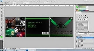
When doing our final CD cover I used adobe Photoshop to edit the CD cover experience in other subjects such as photography helped me do this quickly and easily with little difficulty, this created a simple but professional looking CD cover.

Friday, 10 December 2010
Final CD cover
Tuesday, 23 November 2010
Wednesday, 17 November 2010
Tuesday, 16 November 2010
6th 9th 11th November 2010
Today we decided to film a shot that would take a long time but be worth it if it came out correctly, we began filming the sky and sun from the top of the hill and waited until it got dark, the sunset lasted about an hour but using the editing software we fast forward it to give the effect of time going quickly, the shot came out exactly how we wanted, with clouds moving across the sky and the sun going down. The use of this shot is so that there is a transition from day to night in the middle of our video, it is also a technical shot and looks very effective as part of our video. This type of shot is used quite a lot in films and extreme sports videos; the shot looks professional and effective boosting the quality of our video. Another shot we filmed was of a car sound system that exaggerates the base, when filming this we played the track ‘Showdown’ so that we could sync the music with the video we had filmed. At college we used editing software to add in the videos we had filmed, we fast forwarded the sunset video and added in the shot of the base as an abstract part of the video. Also we added a blinking effect to the opening point of view shot of the character waking up and walking around his bedroom, as he looks out the window he blinks twice and the shot comes into focus gradually, by doing this we convey the effect of tiredness and that he has just woken up and his eyes are adapting to the light.
Subscribe to:
Posts (Atom)


